hi! here's what i'm trying to achieve: i want my journal's main page to display one entry (the most recent one), and i want that entry to be vertically centered, so that the distance from the top of the entry to the navstrip is the same as the distance from the bottom of the entry to the bottom of the page. here is a quick mockup of what i have in mind:
i've tried using margin: auto for this, but it didn't work; googling around leads me to believe that that's because the entry container is an inline element and thus doesn't have a specified height, which you need for that to work. i thought about using a flexbox inside the entry with three elements arranged in a column, with the middle element holding the actual contents of the entry and the top and bottom elements growing/shrinking to provide padding, to achieve something visually similar, but i don't think that would work either for the same reason (no specified height).
is there any way to do this? the theme i'm currently using is blanket, but i'm not married to it, so if there is a different theme that allows me to do this, i will happily switch.
I’ve heard some opinions over the years that accessibility on Android is difficult to work with and sometimes “hacky” to do certain things, but I’ve come to enjoy how the accessibility framework is put together, and I hope to be able to share some of that with you and demystify some of the inner workings. There is a lot that goes into the accessibility framework in Android, so for now, we will just focus on 4.1.2 Name, Role, Value, but primarily just “Role”.
TalkBack is not a standard
TalkBack is a powerful tool for testing accessibility on Android devices, but keep in mind that it is not the actual standard. For example, if you are using TalkBack and you hear it announce “Submit button double tap to activate” — that may sound correct, but the role of button might not be applied correctly — the role may be applied as part of the accessible name.
Let’s assume that the button has a name of “Submit button” with no actual role applied. Now that might be mostly a non-issue for TalkBack users because “users know what they know/want” (this is a common misunderstanding in user experience design). TalkBack users hear “Submit button” so they know it is a button, but what about non-speech output users like Braille display users for example?
Braille display users would also get “Submit button”, but that’s not actually what Braille users are expecting. They are expecting “Submit btn” with “button” abbreviated. This because space is a premium on Braille displays. Braille displays are limited to how many characters they can display at once before the user has to “pan” to read more content.
The larger the Braille display, the more characters can be displayed at once, but a larger Braille display is significantly more expensive than a smaller one. The abbreviated “btn” for Braille versus the full “button” text is a 50% space savings for Braille users. This is one reason why it is important to apply roles as they are intended. Also keep in mind, that depending on the user’s settings, Braille displays will also have a status cell followed by an empty cell before the actual Braille output begins. So in reality, most users are limited to two less Braille cells for their actual output.
The Braille output below compares a control called “Submit button” with the role added as part of the name, versus a control called “Submit” with the role added in the way that is expected by the accessibility service, which allows the Braille service to abbreviate the role as “btn”. The Braille output is using the Liblouis, US 8 dot in English Braille table which is one of many different types of Braille output.
It is up to the developer to apply roles in the way that that the accessibility framework is expecting it so that any accessibility service can do what it needs to do with the content and produce the expected results for the user. This is the “robust” portion of “Perceivable, Operable, Understandable, and Robust” (POUR). If the role is not applied in a manner that can be programmatically determined, then it is a failure of 4.1.2 Name, Role, Value.
Double tap to activate
There are some opinions that TalkBack announcing “Double tap to activate” is enough information for the user to know that this is a button or something actionable. This is something that TalkBack does, which can be helpful. But TalkBack isn’t the standard; it is a tool we can use to help determine if accessibility is properly implemented. This announcement is considered a usage hint and can be easily disabled in the TalkBack settings. If a user has this disabled because they are familiar with how to interact with TalkBack, they will not know if a control can be activated unless it has a role like “button”.
What causes TalkBack to announce “Double tap to activate”? This is just a hint for a view that has the OnClickListener attached to it. This is the same scenario as a screen reader like NVDA announcing “clickable” when navigating a web page. Something can be clickable but doesn’t actually do anything for the user. For example, a View may have the OnClickListener attached to it just to collect some analytics on where a user taps on the screen. It doesn’t have to actually do anything for the user in order to be announced with “Double tap to activate”.
Consider the code below where I am creating a generic View. This View has an OnClickListener set on it, but I decide to not do anything with it, just leave the listener empty.
TextView emptyClickView = findViewById(R.id.emptyClick);
emptyClickView.setContentDescription("I am not a button");

emptyClickView.setOnClickListener(new View.OnClickListener() {

    @Override
    public void onClick(View v) {
        // do nothing
    }

});
As the image above shows, the onClick doesn’t do anything, but TalkBack will announce this as “I am not a button. Double tap to activate” because there is an OnClickListener provided. Users should not have to rely on the “Double tap to activate” announcement to provide any concrete information on the role.
You will hear something similar for a view when the OnLongClickListener is attached to it in the form of “Double tap and hold to long press”. This is just letting the user know that they can long press to perform an action.
As I mentioned before, this is something that TalkBack does to help users. This is not an accessibility standard. Anyone can make screen reader for Android, and what the screen reader (or any accessibility service) should be looking for is a role like “button” to tell the user what to expect when they click this.
Methods of providing roles
Native controls
Native controls automatically have roles. If you use a Button or any View that extends from android.widget.Button, then it will automatically have the role of “button”. This is similar to HTML in that if you keep it simple and use the built-in widgets, then it just works. But sometimes that isn’t an option, or it’s more work to customize a Button widget to look how you need it to, or you need the Button widget to contain a child view (which it isn’t designed to handle). This is where we can get creative.
View.getAccessibilityClassName()
The first thing that you can do is to create a custom class and extend from android.view.View. This is the base class of all of the standard widgets. Within that class, there’s a method that is meant to be overridden called getAccessibilityClassName. This is where the operating system first looks for a role when building the accessibility tree (you can override this, which we’ll go over later). We’ll extend from LinearLayout since I want this to be a vertical stack container.
public class CustomButton extends LinearLayout {

    public CustomButton(Context context) {
        super(context);
        LayoutInflater inflater = (LayoutInflater) context
                .getSystemService(Context.LAYOUT_INFLATER_SERVICE);
        inflater.inflate(R.layout.custom_button, this, true);
    }

    public CustomButton(Context context, AttributeSet attributeSet) {
        super(context, attributeSet);
        LayoutInflater inflater = (LayoutInflater) context
                .getSystemService(Context.LAYOUT_INFLATER_SERVICE);
        inflater.inflate(R.layout.custom_button, this, true);
    }

    @Override
    public CharSequence getAccessibilityClassName() {
        // return a button class name for this
        // You have to use the getName() of native Android widget classes
        return Button.class.getName();
    }
}
This is broken up into 3 utterances by TalkBack:
“Button”;
“This is a custom button”;
“With multiple children”.
[Error: Irreparable invalid markup ('<img [...] 300w">') in entry. Owner must fix manually. Raw contents below.]
<p class="syndicationauthor">Posted by John Lilly</p><p class="ljsyndicationlink"><a href="https://www.tpgi.com/robust-roles-on-android/">https://www.tpgi.com/robust-roles-on-android/</a></p><p class="ljsyndicationlink"><a href="https://www.tpgi.com/?p=10331">https://www.tpgi.com/?p=10331</a></p><p>I’ve heard some opinions over the years that accessibility on Android is difficult to work with and sometimes “hacky” to do certain things, but I’ve come to enjoy how the accessibility framework is put together, and I hope to be able to share some of that with you and demystify some of the inner workings. There is a lot that goes into the accessibility framework in Android, so for now, we will just focus on <a rel="noopener noreferrer" href="https://www.w3.org/WAI/WCAG22/Understanding/name-role-value.html">4.1.2 Name, Role, Value</a>, but primarily just “Role”.</p>
<aside aria-label="Note" class="note">This article is intended for technical audiences such as frontend Android developers. It relies heavily on code examples for the View-based projects. Code examples are given in Java, but Android studio will automatically convert Java to Kotlin when pasted into the IDE if you happen to be using Kotlin.</aside>
<h2 tabindex="-1" id="talkback-is-not-a-standard">TalkBack is not a standard</h2>
<p>TalkBack is a powerful tool for testing accessibility on Android devices, but keep in mind that it is not the actual standard. For example, if you are using TalkBack and you hear it announce “Submit button double tap to activate” — that may sound correct, but the role of button might not be applied correctly — the role may be applied as part of the accessible name.</p>
<aside aria-label="Note" class="note">If you’d like to check out some <a rel="noopener noreferrer" href="https://www.tpgi.com/csun-recap-testing-mobile-apps-tools-techniques-and-best-practices-part-2-android/">mobile testing techniques</a>, we have an article on this very subject, but that is out of scope for this article.</aside>
<p>Let’s assume that the button has a name of “Submit button” with no actual role applied. Now that might be mostly a non-issue for TalkBack users because “users know what they know/want” (this is a <a rel="noopener noreferrer" href="https://webdesignerdepot.com/the-usability-myth-users-dont-really-know-what-they-want-and-thats-totally-ok/">common misunderstanding in user experience design</a>). TalkBack users hear “Submit button” so they know it is a button, but what about non-speech output users like Braille display users for example?</p>
<p>Braille display users would also get “Submit button”, but that’s not actually what Braille users are expecting. They are expecting “Submit btn” with “button” abbreviated. This because space is a premium on Braille displays. Braille displays are limited to how many characters they can display at once before the user has to “pan” to read more content.</p>
<figure>
<img fetchpriority="high" decoding="async" src="https://www.tpgi.com/wp-content/uploads/Focus-14.jpg" alt="" width="612" height="208" class="alignnone size-full wp-image-10345" style="border: 1px solid #242424; border-radius: 12px; padding: 6px;" srcset="https://www.tpgi.com/wp-content/uploads/Focus-14.jpg 612w, https://www.tpgi.com/wp-content/uploads/Focus-14-300x102.jpg 300w" sizes="(max-width: 612px) 100vw, 612px" /><figcaption style="text-align:center;"><a rel="noopener noreferrer" href="https://www.freedomscientific.com/products/blindness/focus14brailledisplay/">The Freedom Scientific Focus 14 Braille Display</a>, which can display 14 characters at a time.</figcaption></figure>
<p>The larger the Braille display, the more characters can be displayed at once, but a larger Braille display is significantly more expensive than a smaller one. The abbreviated “btn” for Braille versus the full “button” text is a 50% space savings for Braille users. This is one reason why it is important to apply roles as they are intended. Also keep in mind, that depending on the user’s settings, Braille displays will also have a status cell followed by an empty cell before the actual Braille output begins. So in reality, most users are limited to two less Braille cells for their actual output.</p>
<p>The Braille output below compares a control called “Submit button” with the role added as part of the name, versus a control called “Submit” with the role added in the way that is expected by the accessibility service, which allows the Braille service to abbreviate the role as “btn”. The Braille output is using the Liblouis, US 8 dot in English Braille table which is one of many different types of Braille output.</p>
<p><img decoding="async" src="https://www.tpgi.com/wp-content/uploads/Braille-output.png" alt="Braille output comparing "Submit button" to "Submit btn"" width="526" height="388" class="alignnone size-full wp-image-10335" style="border: 1px solid #242424; border-radius: 12px; padding: 6px;" srcset="https://www.tpgi.com/wp-content/uploads/Braille-output.png 526w, https://www.tpgi.com/wp-content/uploads/Braille-output-300x221.png 300w" sizes="(max-width: 526px) 100vw, 526px" /></p>
<p>It is up to the developer to apply roles in the way that that the accessibility framework is expecting it so that <strong><em>any</em></strong> accessibility service can do what it needs to do with the content and produce the expected results for the user. This is the “robust” portion of “Perceivable, Operable, Understandable, and Robust” (POUR). If the role is not applied in a manner that can be <a rel="noopener noreferrer" href="https://www.w3.org/WAI/WCAG21/Understanding/name-role-value.html#dfn-programmatically-determined">programmatically determined</a>, then it is a failure of <a rel="noopener noreferrer" href="https://www.w3.org/WAI/WCAG21/Understanding/name-role-value.html">4.1.2 Name, Role, Value</a>.</p>
<h2 tabindex="-1" id="double-tap-to-activate">Double tap to activate</h2>
<p>There are some opinions that TalkBack announcing “Double tap to activate” is enough information for the user to know that this is a button or something actionable. This is something that TalkBack does, which can be helpful. But TalkBack isn’t the standard; it is a tool we can use to help determine if accessibility is properly implemented. This announcement is considered a usage hint and can be easily disabled in the TalkBack settings. If a user has this disabled because they are familiar with how to interact with TalkBack, they will not know if a control can be activated <em>unless</em> it has a role like “button”.</p>
<p>What causes TalkBack to announce “Double tap to activate”? This is just a hint for a view that has the <code>OnClickListener</code> attached to it. This is the same scenario as a screen reader like NVDA announcing “clickable” when navigating a web page. Something can be clickable but doesn’t actually do anything for the user. For example, a <code>View</code> may have the <code>OnClickListener</code> attached to it just to collect some analytics on where a user taps on the screen. It doesn’t have to actually do anything for the user in order to be announced with “Double tap to activate”.</p>
<p>Consider the code below where I am creating a generic <code>View</code>. This <code>View</code> has an <code>OnClickListener</code> set on it, but I decide to not do anything with it, just leave the listener empty.</p>
<pre><code class="language-java">TextView emptyClickView = findViewById(R.id.emptyClick);
emptyClickView.setContentDescription("I am not a button");
emptyClickView.setOnClickListener(new View.OnClickListener() {
@Override
public void onClick(View v) {
// do nothing
}
});</code></pre>
<p><img decoding="async" src="https://www.tpgi.com/wp-content/uploads/Not-a-button1.png" alt="" width="429" height="337" class="alignnone size-full wp-image-10346" style="border: 1px solid #242424; border-radius: 12px;" srcset="https://www.tpgi.com/wp-content/uploads/Not-a-button1.png 429w, https://www.tpgi.com/wp-content/uploads/Not-a-button1-300x236.png 300w" sizes="(max-width: 429px) 100vw, 429px" /></p>
<p><img loading="lazy" decoding="async" src="https://www.tpgi.com/wp-content/uploads/Not-a-button2.png" alt="" width="428" height="339" class="alignnone size-full wp-image-10347" style="border: 1px solid #242424; border-radius: 12px;" srcset="https://www.tpgi.com/wp-content/uploads/Not-a-button2.png 428w, https://www.tpgi.com/wp-content/uploads/Not-a-button2-300x238.png 300w" sizes="auto, (max-width: 428px) 100vw, 428px" /></p>
<p>As the image above shows, the <code>onClick</code> doesn’t do anything, but TalkBack will announce this as “I am not a button. Double tap to activate” because there is an <code>OnClickListener</code> provided. Users should not have to rely on the “Double tap to activate” announcement to provide any concrete information on the role.</p>
<p>You will hear something similar for a view when the <code>OnLongClickListener</code> is attached to it in the form of “Double tap and hold to long press”. This is just letting the user know that they can long press to perform an action.</p>
<p>As I mentioned before, this is something that TalkBack does to help users. This is not an accessibility standard. Anyone can make screen reader for Android, and what the screen reader (or any accessibility service) should be looking for is a role like “button” to tell the user what to expect when they click this.</p>
<h2 tabindex="-1" id="methods-of-providing-roles">Methods of providing roles</h2>
<h3 tabindex="-1" id="native-controls">Native controls</h3>
<p>Native controls automatically have roles. If you use a <code>Button</code> or any <code>View</code> that extends from <code>android.widget.Button</code>, then it will automatically have the role of “button”. This is similar to HTML in that if you keep it simple and use the built-in widgets, then it just works. But sometimes that isn’t an option, or it’s more work to customize a <code>Button</code> widget to look how you need it to, or you need the <code>Button</code> widget to contain a child view (which it isn’t designed to handle). This is where we can get creative.</p>
<h3 tabindex="-1" id="viewgetaccessibilityclassname">View.getAccessibilityClassName()</h3>
<p>The first thing that you can do is to create a custom class and extend from <code>android.view.View</code>. This is the base class of all of the standard widgets. Within that class, there’s a method that is meant to be overridden called <code>getAccessibilityClassName</code>. This is where the operating system first looks for a role when building the accessibility tree (you can override this, which we’ll go over later). We’ll extend from <code>LinearLayout</code> since I want this to be a vertical stack container.</p>
<pre><code class="language-xml"><LinearLayout xmlns:android="http://schemas.android.com/apk/res/android"
android:layout_width="match_parent"
android:layout_height="wrap_content"
android:orientation="vertical">
<TextView
android:id="@+id/textView2"
android:layout_width="match_parent"
android:layout_height="22dp"
android:text="This is a custom button" />
<TextView
android:id="@+id/textView"
android:layout_width="match_parent"
android:layout_height="22dp"
android:text="With multiple children" />
</LinearLayout></code></pre>
<pre><code class="language-xml"> <com.tpgi.myapplication.CustomButton
android:layout_width="match_parent"
android:layout_height="50dp"
app:layout_constraintStart_toStartOf="parent"
app:layout_constraintTop_toBottomOf="@+id/notButton"
android:importantForAccessibility="yes"
android:screenReaderFocusable="true"/></code></pre>
<pre><code class="language-java">public class CustomButton extends LinearLayout {
public CustomButton(Context context) {
super(context);
LayoutInflater inflater = (LayoutInflater) context
.getSystemService(Context.LAYOUT_INFLATER_SERVICE);
inflater.inflate(R.layout.custom_button, this, true);
}
public CustomButton(Context context, AttributeSet attributeSet) {
super(context, attributeSet);
LayoutInflater inflater = (LayoutInflater) context
.getSystemService(Context.LAYOUT_INFLATER_SERVICE);
inflater.inflate(R.layout.custom_button, this, true);
}
@Override
public CharSequence getAccessibilityClassName() {
// return a button class name for this
// You have to use the getName() of native Android widget classes
return Button.class.getName();
}
}</code></pre>
<p>This is broken up into 3 utterances by TalkBack:</p>
<ol>
<li>“Button”;</li>
<li>“This is a custom button”;</li>
<li>“With multiple children”.</li>
</ol>
<p><img loading="lazy" decoding="async" src="https://www.tpgi.com/wp-content/uploads/Button-method1.png" alt="" width="428" height="391" class="alignnone size-full wp-image-10339" style="border: 1px solid #242424; border-radius: 12px;” srcset=" https://www.tpgi.com/wp-content/uploads/button-method1.png="https://www.tpgi.com/wp-content/uploads/Button-method1.png" 428w,="428w," https://www.tpgi.com/wp-content/uploads/button-method1-300x274.png="https://www.tpgi.com/wp-content/uploads/Button-method1-300x274.png" 300w"="300w"" sizes="auto, (max-width: 428px) 100vw, 428px" /></p>
<p><img loading="lazy" decoding="async" src="https://www.tpgi.com/wp-content/uploads/Button-method2.png" alt="" width="428" height="377" class="alignnone size-full wp-image-10340" style="border: 1px solid #242424; border-radius: 12px;” srcset=" https://www.tpgi.com/wp-content/uploads/button-method2.png="https://www.tpgi.com/wp-content/uploads/Button-method2.png" 428w,="428w," https://www.tpgi.com/wp-content/uploads/button-method2-300x264.png="https://www.tpgi.com/wp-content/uploads/Button-method2-300x264.png" 300w"="300w"" sizes="auto, (max-width: 428px) 100vw, 428px" /></p>
<p><img loading="lazy" decoding="async" src="https://www.tpgi.com/wp-content/uploads/Button-method3.png" alt="" width="427" height="380" class="alignnone size-full wp-image-10341" style="border: 1px solid #242424; border-radius: 12px;” srcset=" https://www.tpgi.com/wp-content/uploads/button-method3.png="https://www.tpgi.com/wp-content/uploads/Button-method3.png" 427w,="427w," https://www.tpgi.com/wp-content/uploads/button-method3-300x267.png="https://www.tpgi.com/wp-content/uploads/Button-method3-300x267.png" 300w"="300w"" sizes="auto, (max-width: 427px) 100vw, 427px" /></p>
<p>If you inspect the accessibility tree of this view, you will find that it is a <code>Button</code> with two <code>TextView</code> children. This is why TalkBack is announcing it in this order.</p>
<p><img loading="lazy" decoding="async" src="https://www.tpgi.com/wp-content/uploads/Button-method-inspect-1024x821.png" alt="" width="750" height="601" class="alignnone size-large wp-image-10338" style="border: 1px solid #242424; border-radius: 12px;” srcset=" https://www.tpgi.com/wp-content/uploads/button-method-inspect-1024x821.png="https://www.tpgi.com/wp-content/uploads/Button-method-inspect-1024x821.png" 1024w,="1024w," https://www.tpgi.com/wp-content/uploads/button-method-inspect-300x241.png="https://www.tpgi.com/wp-content/uploads/Button-method-inspect-300x241.png" 300w,="300w," https://www.tpgi.com/wp-content/uploads/button-method-inspect-768x616.png="https://www.tpgi.com/wp-content/uploads/Button-method-inspect-768x616.png" 768w,="768w," https://www.tpgi.com/wp-content/uploads/button-method-inspect.png="https://www.tpgi.com/wp-content/uploads/Button-method-inspect.png" 1182w"="1182w"" sizes="auto, (max-width: 750px) 100vw, 750px" /></p>
<p>You could make this a single utterance for the actual text by concatenating all of the text from the child elements into the <code>contentDescription</code> for the parent view, but that would be an ease of use enhancement (one that I do actually recommend for speed of navigation). TalkBack will always announce the role in an utterance separate from the content of the view.</p>
<p><img loading="lazy" decoding="async" src="https://www.tpgi.com/wp-content/uploads/Button-method-combined1.png" alt="" width="429" height="407" class="alignnone size-full wp-image-10336" style="border: 1px solid #242424; border-radius: 12px;” srcset=" https://www.tpgi.com/wp-content/uploads/button-method-combined1.png="https://www.tpgi.com/wp-content/uploads/Button-method-combined1.png" 429w,="429w," https://www.tpgi.com/wp-content/uploads/button-method-combined1-300x285.png="https://www.tpgi.com/wp-content/uploads/Button-method-combined1-300x285.png" 300w"="300w"" sizes="auto, (max-width: 429px) 100vw, 429px" /></p>
<p><img loading="lazy" decoding="async" src="https://www.tpgi.com/wp-content/uploads/Button-method-combined2.png" alt="" width="427" height="379" class="alignnone size-full wp-image-10337" style="border: 1px solid #242424; border-radius: 12px;” srcset=" https://www.tpgi.com/wp-content/uploads/button-method-combined2.png="https://www.tpgi.com/wp-content/uploads/Button-method-combined2.png" 427w,="427w," https://www.tpgi.com/wp-content/uploads/button-method-combined2-300x266.png="https://www.tpgi.com/wp-content/uploads/Button-method-combined2-300x266.png" 300w"="300w"" sizes="auto, (max-width: 427px) 100vw, 427px" /></p>
<p>This is just a single line of code assuming you’re using only one constructor. Theoretically, you can override <code>getContentDescription</code> for the custom view, but Google doesn’t recommend doing that and will show a warning in Android Studio.</p>
<pre><code class="language-java">public CustomButton(Context context, AttributeSet attributeSet) {
super(context, attributeSet);
LayoutInflater inflater = (LayoutInflater) context
.getSystemService(Context.LAYOUT_INFLATER_SERVICE);
inflater.inflate(R.layout.custom_button, this, true);
this.setContentDescription("This is a custom button \nWith multiple children");
}
</code></pre>
<p>More information about the <code>getAccessibilityClassName()</code> method can be found in the <a rel="noopener noreferrer" href="https://developer.android.com/reference/android/view/View#getAccessibilityClassName()">developer documentation for the View class</a>.</p>
<h3 tabindex="-1" id="accessibilitydelegate">AccessibilityDelegate</h3>
<p>The <code>AccessibilityDelegate</code> is my favorite way of applying roles in Android. It offers complete control of the accessibility information for the view. We’re only going to be looking at setting a role, but with the <code>AccessibilityDelegate</code>, you can do pretty much anything (within the realms of the API) including reacting to accessibility events, applying custom accessibility actions, and even making custom modes of navigation.</p>
<aside aria-label="Note" class="note">Many years ago in a now defunct app, I made a custom heading navigation for navigating markdown content. The app parsed markdown headings (indicated by the # symbol) and could jump between those pieces of text when navigating by heading. That is way out of scope for this article, but just know that the <code>AccessibilityDelegate</code> is very powerful!</aside>
<p>Now let’s get back to the <code>AccessibilityDelegate</code> and roles. The <code>AccessibilityDelegate</code> allows us to modify the <code>AccessibilityNodeInfo</code> for the view. This is the information that an accessibility service like TalkBack reads to determine all characteristics of a <code>View</code>. The code below is creating a class called <code>ButtonDelegate</code> that extends from <code>View.AccessibilityDelegate</code>. Inside of that class, we are overriding the <code>onInitializeAccessibilityNodeInfo</code> and calling <code>setClassName</code> on the <code>AccessibilityNodeInfo</code> object to override the role presented to accessibility services.</p>
<pre><code class="language-java">public class ButtonDelegate extends View.AccessibilityDelegate {
@Override
public void onInitializeAccessibilityNodeInfo(@NonNull View view, @NonNull AccessibilityNodeInfo info) {
super.onInitializeAccessibilityNodeInfo(view, info);
// set the class name to a Button
info.setClassName(Button.class.getName());
}
}</code></pre>
<p>Now that we have a custom <code>AccessibilityDelegate</code> we can reuse this class to override the role of any <code>View</code> and make it a button. In the example below, I have created a simple <code>TextView</code>. Normally, these would be announced without a role, but since we have the <code>ButtonDelegate</code>, we can easily add a role. On the <code>TextView</code>, call <code>setAccessibilityDelegate</code> and set it to the new delegate we created. And that’s it!</p>
<p>We can create a simple <code>TextView</code> in XML.</p>
<pre><code class="language-xml"><TextView
android:id="@+id/delegateView"
android:layout_width="wrap_content"
android:layout_height="wrap_content"
android:text="Custom Delegate" /></code></pre>
<p>And finally set the <code>AccessibilityDelegate</code> to our custom one.</p>
<pre><code class="language-java">TextView delegateView = findViewById(R.id.delegateView);
ButtonDelegate buttonDelegate = new ButtonDelegate();
delegateView.setAccessibilityDelegate(buttonDelegate);</code></pre>
<p>This causes the <code>TextView</code> to now be identified as a Button, and we can verify this with an <a rel="noopener noreferrer" href="https://github.com/jwlilly/Android-Accessibility-Inspector-App">accessibility inspector</a>. The view is just a single view — with no children and a text property of “Custom delegate” — which is what we created in the XML, aside from the role that we just overrode in the Java file.</p>
<p><img loading="lazy" decoding="async" src="https://www.tpgi.com/wp-content/uploads/Custom-delegate1.png" alt="" width="428" height="416" class="alignnone size-full wp-image-10343" style="border: 1px solid #242424; border-radius: 12px;” srcset=" https://www.tpgi.com/wp-content/uploads/custom-delegate1.png="https://www.tpgi.com/wp-content/uploads/Custom-delegate1.png" 428w,="428w," https://www.tpgi.com/wp-content/uploads/custom-delegate1-300x292.png="https://www.tpgi.com/wp-content/uploads/Custom-delegate1-300x292.png" 300w"="300w"" sizes="auto, (max-width: 428px) 100vw, 428px" /></p>
<p><img loading="lazy" decoding="async" src="https://www.tpgi.com/wp-content/uploads/Custom-delegate2.png" alt="" width="429" height="410" class="alignnone size-full wp-image-10344" style="border: 1px solid #242424; border-radius: 12px;” srcset=" https://www.tpgi.com/wp-content/uploads/custom-delegate2.png="https://www.tpgi.com/wp-content/uploads/Custom-delegate2.png" 429w,="429w," https://www.tpgi.com/wp-content/uploads/custom-delegate2-300x287.png="https://www.tpgi.com/wp-content/uploads/Custom-delegate2-300x287.png" 300w"="300w"" sizes="auto, (max-width: 429px) 100vw, 429px" /></p>
<p><img loading="lazy" decoding="async" src="https://www.tpgi.com/wp-content/uploads/Custom-delegate-inspector-1024x820.png" alt="" width="750" height="601" class="alignnone size-large wp-image-10342" style="border: 1px solid #242424; border-radius: 12px;” srcset=" https://www.tpgi.com/wp-content/uploads/custom-delegate-inspector-1024x820.png="https://www.tpgi.com/wp-content/uploads/Custom-delegate-inspector-1024x820.png" 1024w,="1024w," https://www.tpgi.com/wp-content/uploads/custom-delegate-inspector-300x240.png="https://www.tpgi.com/wp-content/uploads/Custom-delegate-inspector-300x240.png" 300w,="300w," https://www.tpgi.com/wp-content/uploads/custom-delegate-inspector-768x615.png="https://www.tpgi.com/wp-content/uploads/Custom-delegate-inspector-768x615.png" 768w,="768w," https://www.tpgi.com/wp-content/uploads/custom-delegate-inspector.png="https://www.tpgi.com/wp-content/uploads/Custom-delegate-inspector.png" 1184w"="1184w"" sizes="auto, (max-width: 750px) 100vw, 750px" /></p>
<h4 tabindex="-1" id="using-a-role-description">Using a role description</h4>
<p>There’s an additional way to apply a role to a view using the <code>AccessibilityNodeInfo</code> — or the <code>AccessibilityNodeInfoCompat</code> class to be exact. The <code>AccessibilityNodeInfoCompat</code> class is just a helper class that Google has created to extend the functionality of the base <code>AccessibilityNodeInfo</code> and make it a little easier to handle. The setup for the compat class is the same as creating a custom <code>AccessibilityDelegate</code> except you use <code>AccessibilityNodeInfoCompat</code> to wrap the <code>AccessibilityNodeInfo</code> object (it’ll make more sense with the code example below). Within <code>AccessibilityNodeInfoCompat</code>, there is a method called <code>setRoleDescription</code>. This method allows us to set <em>any</em> text as the role for the <code>View</code>. This method does not take localization into account, so if you’re using this method, you’ll need to do that on your own.</p>
<p>It is also important to take into account that other accessibility services may not know what to do with a <code>roleDescription</code> since it is not part of the base <code>AccessibilityNodeInfo</code> class. Braille displays will not abbreviate this information (based on a quick search of the TalkBack source) such as “btn” for the “Button” role since the role is not being applied as it is expected for a button. In other words, it’s not robust.</p>
<p>The only practical use case for this method is when you’re creating a tab control, since tabs do not exist in the base Android widgets. Google has one as <a rel="noopener noreferrer" href="https://developer.android.com/reference/com/google/android/material/tabs/TabLayout">part of the Material components</a> but <code>android.widget</code> (the base Android widget class) does not contain a <code>Tab</code> class. In the code below, I am applying the “Tab” role to a <code>TextView</code> that we created in the XML.</p>
<pre><code class="language-xml"><TextView
android:id="@+id/roleDescriptionView"
android:layout_width="wrap_content"
android:layout_height="wrap_content"
android:text="Role description"/></code></pre>
<p>Create a custom <code>TabDelegate</code> that extends from <code>AccessibilityDelegate</code>.</p>
<pre><code class="language-java">public class TabDelegate extends View.AccessibilityDelegate{
@Override
public void onInitializeAccessibilityNodeInfo(@NonNull View view, @NonNull AccessibilityNodeInfo info){
super.onInitializeAccessibilityNodeInfo(view, info);
// create an AccessibilityNodeInfoCompat object
AccessibilityNodeInfoCompat infoCompat = AccessibilityNodeInfoCompat.wrap(info);
// set the role description to "Tab"
infoCompat.setRoleDescription("Tab");
}
}</code></pre>
<p>Apply the <code>TabDelegate</code> to the <code>TextView</code> that we created.</p>
<pre><code class="language-java">TextView roleDescriptionView = findViewById(R.id.roleDescriptionView);
TabDelegate tabDelegate = new TabDelegate();
roleDescriptionView.setAccessibilityDelegate(tabDelegate);</code></pre>
<p>This causes the <code>TextView</code> to be announced as a “Tab”, and with an accessibility inspector we can confirm that the role description is set to “Tab”. The tab control that Google has created (like in the Google Play Store) would be exposed in the accessibility inspector in exactly the same way.</p>
<p><img loading="lazy" decoding="async" src="https://www.tpgi.com/wp-content/uploads/Role-description1.png" alt="" width="428" height="440" class="alignnone size-full wp-image-10352" style="border: 1px solid #242424; border-radius: 12px;” srcset=" https://www.tpgi.com/wp-content/uploads/role-description1.png="https://www.tpgi.com/wp-content/uploads/Role-description1.png" 428w,="428w," https://www.tpgi.com/wp-content/uploads/role-description1-292x300.png="https://www.tpgi.com/wp-content/uploads/Role-description1-292x300.png" 292w"="292w"" sizes="auto, (max-width: 428px) 100vw, 428px" /></p>
<p><img loading="lazy" decoding="async" src="https://www.tpgi.com/wp-content/uploads/Role-description2.png" alt="" width="429" height="432" class="alignnone size-full wp-image-10353" style="border: 1px solid #242424; border-radius: 12px;” srcset=" https://www.tpgi.com/wp-content/uploads/role-description2.png="https://www.tpgi.com/wp-content/uploads/Role-description2.png" 429w,="429w," https://www.tpgi.com/wp-content/uploads/role-description2-298x300.png="https://www.tpgi.com/wp-content/uploads/Role-description2-298x300.png" 298w,="298w," https://www.tpgi.com/wp-content/uploads/role-description2-100x100.png="https://www.tpgi.com/wp-content/uploads/Role-description2-100x100.png" 100w"="100w"" sizes="auto, (max-width: 429px) 100vw, 429px" /></p>
<p><img loading="lazy" decoding="async" src="https://www.tpgi.com/wp-content/uploads/Role-description-inspector-1024x821.png" alt="" width="750" height="601" class="alignnone size-large wp-image-10351" style="border: 1px solid #242424; border-radius: 12px;” srcset=" https://www.tpgi.com/wp-content/uploads/role-description-inspector-1024x821.png="https://www.tpgi.com/wp-content/uploads/Role-description-inspector-1024x821.png" 1024w,="1024w," https://www.tpgi.com/wp-content/uploads/role-description-inspector-300x241.png="https://www.tpgi.com/wp-content/uploads/Role-description-inspector-300x241.png" 300w,="300w," https://www.tpgi.com/wp-content/uploads/role-description-inspector-768x616.png="https://www.tpgi.com/wp-content/uploads/Role-description-inspector-768x616.png" 768w,="768w," https://www.tpgi.com/wp-content/uploads/role-description-inspector.png="https://www.tpgi.com/wp-content/uploads/Role-description-inspector.png" 1182w"="1182w"" sizes="auto, (max-width: 750px) 100vw, 750px" /></p>
<aside aria-label="Note" class="note">TalkBack does have support for the <code>TabWidget</code> and <code>ActionBar.Tab</code> classes, but these don’t assign roles. They seem to only have an effect on how TalkBack announces text. When focus is inside one of these classes, it makes TalkBack become uninterruptible by new speech. This is likely an attempt to not allow announcements or live regions to interrupt the announcement of a “selected” state.</aside>
<h2 tabindex="-1" id="clickable-imageview">Clickable ImageView</h2>
<p>Any <code>ImageView</code> that is clickable will automatically be announced as a button by TalkBack. This is something that I do not agree with, because TalkBack is inferring a role based on two properties, instead of relying on just a single property (like the classname or role description). It is helpful for users, but for third-party accessibility services, it means that they will need to follow this convention as well to have parity with TalkBack. And a third-party developer wouldn’t know about this inference without knowing the TalkBack source code.</p>
<p>In the <a rel="noopener noreferrer" href="https://github.com/google/talkback/blob/26a27dc009d5b3605e744222541f045a3c24e038/utils/src/main/java/com/google/android/accessibility/utils/Role.java#L265">TalkBack source code</a>, it checks to see if the node is an <code>ImageView</code> and if it is clickable. If both of those are true, then it’s treated as a button.</p>
<h2 tabindex="-1" id="sometimes-you-just-cant-apply-roles">Sometimes you just can’t apply roles</h2>
<p>I will admit that sometimes, it isn’t possible or practical to apply roles for some situations. Google seems to be correcting this with their Jetpack Compose framework, but for View-based projects, if you can’t access the <code>View</code> object for a certain view, then you can’t apply an <code>AccessibilityDelegate</code> to that view. This seems to be limited to a few circumstances:</p>
<ol>
<li><strong>Menus</strong> — specifically ones that are announced as “popup menu”. These are often found as part of the top action bar as part of the overflow menu (kebab or 3 vertical dots icon). For these, you can set the text content of the menu, but you don’t have practical access to the actual <code>View</code> object and therefore can’t apply any customizations to the accessibility information.</li>
<li><strong>Settings Fragment</strong> — or anything to do with a <code>SettingsFragment</code> or <code>SettingsActivity</code>. These are generally portions of the app that look like the built-in settings app. These classes use XML files to build user preferences layouts. It makes it very easy to build out user options and preferences, but these classes completely hide the <code>View</code> objects from developers. So you don’t have access to apply an <code>AccessibilityDelegate</code>.</li>
</ol>
<h3 tabindex="-1" id="misconceptions-on-listview-and-recyclerview">Misconceptions on ListView and RecyclerView</h3>
<p>I’ve run into opinions that claim it’s not possible to set roles on a <code>ListView</code> and a <code>RecyclerView</code>. It is important to keep in mind that a <code>ListView</code> and a <code>RecyclerView</code> are nothing more than fancy scroll views that contain stacked children views. As I mentioned before, if you have access to the <code>View</code> object, you can set an <code>AccessibilityDelegate</code>; and if you can set an <code>AccessibilityDelegate</code>, you can provide a role.</p>
<p>With a <code>ListView</code> and a <code>RecyclerView</code>, there are a few different ways to build them, but most of the time, they are built with an XML layout containing the view that you want to act as the template of the repeating view of the stack. This is one where you can create a custom view and override the role using one of the methods I mentioned earlier.</p>
<p>Below is an example using a <code>ViewHolder</code> (which is specific to a <code>RecyclerView</code>, but the concepts would still apply to a <code>ListView</code>). Note that this is not the full class of a custom <code>RecyclerView</code> — only the relevant part for overriding the role.</p>
<pre><code class="language-java">public static class ViewHolder extends RecyclerView.ViewHolder {
private final TextView textView;
public ViewHolder(View v) {
super(v);
v.setOnClickListener(new View.OnClickListener() {
@Override
public void onClick(View v) {
//do something
}
});
View.AccessibilityDelegate accessibilityDelegate = new View.AccessibilityDelegate() {
@Override
public void onInitializeAccessibilityNodeInfo(View view, AccessibilityNodeInfo info) {
super.onInitializeAccessibilityNodeInfo(view, info);
// set the role to a button
info.setClassName(Button.class.getName());
}
};
textView = v.findViewById(R.id.textView);
textView.setAccessibilityDelegate(accessibilityDelegate);
}
public TextView getTextView() {
return textView;
}
}</code></pre>
<p>The output of this is similar to the previous examples except the <code>RecyclerView</code> adds list semantics. So on top of announcing as a “Button”, it also announces the index of the button in the list.</p>
<p><img loading="lazy" decoding="async" src="https://www.tpgi.com/wp-content/uploads/Recycler1.png" alt="" width="428" height="897" class="alignnone size-full wp-image-10349" style="border: 1px solid #242424; border-radius: 12px;” srcset=" https://www.tpgi.com/wp-content/uploads/recycler1.png="https://www.tpgi.com/wp-content/uploads/Recycler1.png" 428w,="428w," https://www.tpgi.com/wp-content/uploads/recycler1-143x300.png="https://www.tpgi.com/wp-content/uploads/Recycler1-143x300.png" 143w"="143w"" sizes="auto, (max-width: 428px) 100vw, 428px" /></p>
<p><img loading="lazy" decoding="async" src="https://www.tpgi.com/wp-content/uploads/Recycler2.png" alt="" width="429" height="896" class="alignnone size-full wp-image-10350" style="border: 1px solid #242424; border-radius: 12px;” srcset=" https://www.tpgi.com/wp-content/uploads/recycler2.png="https://www.tpgi.com/wp-content/uploads/Recycler2.png" 429w,="429w," https://www.tpgi.com/wp-content/uploads/recycler2-144x300.png="https://www.tpgi.com/wp-content/uploads/Recycler2-144x300.png" 144w"="144w"" sizes="auto, (max-width: 429px) 100vw, 429px" /></p>
<p><img loading="lazy" decoding="async" src="https://www.tpgi.com/wp-content/uploads/Recycler-inspector-1024x823.png" alt="" width="750" height="603" class="alignnone size-large wp-image-10348" style="border: 1px solid #242424; border-radius: 12px;” srcset=" https://www.tpgi.com/wp-content/uploads/recycler-inspector-1024x823.png="https://www.tpgi.com/wp-content/uploads/Recycler-inspector-1024x823.png" 1024w,="1024w," https://www.tpgi.com/wp-content/uploads/recycler-inspector-300x241.png="https://www.tpgi.com/wp-content/uploads/Recycler-inspector-300x241.png" 300w,="300w," https://www.tpgi.com/wp-content/uploads/recycler-inspector-768x617.png="https://www.tpgi.com/wp-content/uploads/Recycler-inspector-768x617.png" 768w,="768w," https://www.tpgi.com/wp-content/uploads/recycler-inspector.png="https://www.tpgi.com/wp-content/uploads/Recycler-inspector.png" 1180w"="1180w"" sizes="auto, (max-width: 750px) 100vw, 750px" /></p>
<h2 tabindex="-1" id="conclusion">Conclusion</h2>
<p>While it may seem convenient to rely on “Double tab to activate” as an indication of a role, in the end, it is just a usage hint and can be disabled by the user. There are several methods of applying roles in native Android apps, and I will admit, that some methods aren’t intuitive (or documented very well). But once you get the hang of manipulating the accessibility nodes, it’s fairly easy and doesn’t take very many lines of code.</p>
<p>If you are already making a custom class that extends from <code>View</code>, then you can override a single method to set the role of the view. This is two lines of code (excluding the closing curly brace and the <code>@Override</code> annotation). One rule of thumb is that if you’re going to be making a custom clickable view and it doesn’t have any checked states (meaning its a button and not a checkbox or radio button), go ahead and override the <code>getAccessibilityClassName()</code> method to return <code>Button.class.getName()</code>.</p>
<p>If custom views ain’t your bag, or you need a little more control over the accessibility node, then the <code>AccessibilityDelegate</code> is the way to go. And keep in mind that if you have access to the <code>View</code> object, then you also have access to do what you need to do with the <code>AccessibilityDelegate</code>.</p>
<p>Coding roles (or any of the other accessibility properties) in the way that is expected is how you create a robust solution for <strong><em>any</em></strong> assistive services (not just TalkBack) to use. And if new accessibility features are released for existing accessibility services, and your app has implemented accessibility in a robust way, you will likely need to do nothing for your users to enjoy the new accessibility features. Because the expected properties are already there and ready to be taken advantage of.</p>
<h2 tabindex="-1" id="resources">Resources</h2>
<ul>
<li><a rel="noopener noreferrer" href="https://github.com/jwlilly/Android-Accessibility-Inspector-App/tree/master">Android Accessibility Inspector</a></li>
<li><a rel="noopener noreferrer" href="https://developer.android.com/reference/android/view/View.AccessibilityDelegate"><code>View.AccessibilityDelegate</code></a></li>
<li><a rel="noopener noreferrer" href="https://developer.android.com/reference/android/view/accessibility/AccessibilityNodeInfo"><code>AccessibilityNodeInfo</code></a></li>
<li><a rel="noopener noreferrer" href="https://developer.android.com/reference/android/view/View#getAccessibilityClassName()"><code>View.getAccessibilityClassName()</code></a></li>
<li><a rel="noopener noreferrer" href="https://developer.android.com/reference/androidx/recyclerview/widget/RecyclerView"><code>RecyclerView</code></a></li>
</ul>
<hr>
<p><strong>Image credit:</strong> <a rel="noopener noreferrer" href="https://unsplash.com/@32steps">Merve Sehirli Nasir</a>.</p>
<div class="note">
Like to be notified about more articles like this? Subscribe to the <a rel="noopener noreferrer" href="https://www.tpgi.com/knowledge-center-newsletter/">Knowledge Center Newsletter</a>. It not only gives you summaries and links to our technical blog posts but also TPGi webinars, podcasts, and business blog posts – as well as accessibility and web tech conferences and other events, and a reading list of other relevant articles. You get one email a month, it’s free, requires just your email address, and we promise we won’t share that with anyone. <a rel="noopener noreferrer" href="https://www.tpgi.com/knowledge-center-newsletter/">Check the archive</a>.
</div>
<p>The post <a href="https://www.tpgi.com/robust-roles-on-android/">Robust roles on Android</a> appeared first on <a href="https://www.tpgi.com">TPGi</a>.</p><p class="ljsyndicationlink"><a href="https://www.tpgi.com/robust-roles-on-android/">https://www.tpgi.com/robust-roles-on-android/</a></p><p class="ljsyndicationlink"><a href="https://www.tpgi.com/?p=10331">https://www.tpgi.com/?p=10331</a></p>
Artificial Intelligence (AI) is moving fast. But what is it really doing for accessibility? In the next episode of The State of Accessibility podcast, Mark Miller and David Sloan break down where AI is helping, where it’s hurting, and why the story is far from over.
The conversation was too big for one episode, so don’t miss Part 2! Join us live on our LinkedIn on June 24, 2025, at 10:30 AM EST where we’ll continue this discussion and explore how AI is reshaping accessibility testing.
Four years ago, I wrote an article titled Minding the “gap”, where I talked about the CSS gap property, where it applied, and how it worked with various CSS layouts.
At the time, I described how easy it was to evenly space items out in a flex, grid, or multi-column layout, by using the gap property. But, I also said that styling the gap areas was much harder, and I shared a workaround.
However, workarounds like using extra HTML elements, pseudo-elements, or borders to draw separator lines tend to come with drawbacks, especially those that impact your layout size, interfere with assistive technologies, or pollute your markup with style-only elements.
Today, I’m writing again about layout gaps, but this time, to tell you all about a new and exciting CSS feature that’s going to change it all. What you previously had to use workarounds for, you’ll soon be able to do with just a few simple CSS properties that make it easy, yet also flexible, to display styled separators between your layout items.
There’s already a specification draft for the feature you can peruse. At the time I’m writing this, it is available in Chrome and Edge 139 behind a flag. But I believe it won’t be long before we turn that flag on. I believe other browsers are also very receptive and engaged.
Displaying decorative lines between items of a layout can make a big difference. When used well, these lines can bring more structure to your layout, and give your users more of a sense of how the different regions of a page are organized.
Introducing CSS gap decorations
If you’ve ever used a multi-column layout, such as by using the column-width property, then you might already be familiar with gap decorations. You can draw vertical lines between the columns of a multi-column layout by using the column-rule property:
The CSS gap decorations feature builds on this to provide a more comprehensive system that makes it easy for you to draw separator lines in other layout types.
For example, the draft specification says that the column-rule property also works in flexbox and grid layouts:
No need for extra elements or borders! The key benefit here is that the decoration happens in CSS only, where it belongs, with no impacts to your semantic markup.
The CSS gap decorations feature also introduces a new row-rule property for drawing lines between rows:
But that’s not all, because the above syntax also allows you to define multiple, comma-separated, line style values, and use the same repeat() function that CSS grid already uses for row and column templates. This makes it possible to define different styles of line decorations in a single layout, and adapt to an unknown number of gaps:
Finally, the CSS gap decorations feature comes with additional CSS properties such as row-rule-break, column-rule-break, row-rule-outset, column-rule-outset, and gap-rule-paint-order, which make it possible to precisely customize the way the separators are drawn, whether they overlap, or where they start and end.
Currently, the CSS gap decorations feature is only available in Chromium-based browsers.
The feature is still early in the making, and there’s time for you all to try it and to provide feedback that could help make the feature better and more adapted to your needs.
If you want to try the feature today, make sure to use Edge or Chrome, starting with version 139 (or another Chromium-based browser that matches those versions), and enable the flag by following these steps:
In Chrome or Edge, go to about://flags.
In the search field, search for Enable Experimental Web Platform Features.
Let’s build a simple web page to learn how to use the feature. Here is what we’ll be building:
The above layout contains a header section with a title, a navigation menu with a few links, a main section with a series of short paragraphs of text and photos, and a footer.
We’ll start by making the <body> element be a grid container. This way, we can space out the <header>, <nav>, <main>, and <footer> elements apart in one go by using the gap property:
body {
  display: grid;
  gap: 4rem;
  margin: 2rem;
}
Let’s now use the CSS gap decorations feature to display horizontal separator lines within the gaps we just defined:
We can do a bit better by making the first horizontal line look different than the other two lines, and simplify the row-rule value by using the repeat() syntax:
With this new row-rule property value, we’re telling the browser to draw the first horizontal separator as a 1rem thick line, and the next two separators as 2px thick lines, which gives the following result:
Now, let’s turn our attention to the navigation element and its list of links. We’ll use flexbox to display the links in a single row, where each link is separated from the other links by a gap and a vertical line:
nav ul {
  display: flex;
  flex-wrap: wrap;
  gap: 2rem;
  column-rule: 2px dashed #666;
}
Very similarly to how we used the row-rule property before, we’re now using the column-rule property to display a dashed 2px thick separator between the links.
Our example web page now looks like this:
The last thing we need to change is the <main> element and its paragraphs and pictures. We’ll use flexbox again and display the various children in a wrapping row of varying width items:
main {
  display: flex;
  flex-wrap: wrap;
  gap: 4rem;
}


main > * {
  flex: 1 1 200px;
}


main article:has(p) {
  flex-basis: 400px;
}
In the above code snippet, we’re setting the <main> element to be a wrapping flex container with a 4rem gap between items and flex lines. We’re also making the items have a flex basis size of 200px for pictures and 400px for text, and allowing them to grow and shrink as needed. This gives us the following result:
Let’s use CSS gap decorations to bring a little more structure to our layout by drawing 2px thick separator lines between the rows and columns of the layout:
This gives us the following result, which is very close to our expected design:
The last detail we want to change is related to the vertical lines. We don’t want them to span across the entire height of the flex lines but instead start and stop where the content starts and stops.
With CSS gap decorations, we can easily achieve this by using the column-rule-outset property to fine-tune exactly where the decorations start and end, relative to the gap area:
There’s more to the feature and I mentioned a couple more CSS properties earlier
gap-rule-paint-order, which lets you control which of the decorations, rows or columns, appear above the other ones.
row-rule-break / column-rule-break, which sets the behavior of the decoration lines at intersections. In particular, whether they are made of multiple segments, which start and end at intersections, or single, continuous lines.
Because the feature is new, there isn’t MDN documentation about it yet. So to learn more, check out:
The Edge team has also created an interactive playground where you can use visual controls to configure gap decorations.
And, of course, the reason this is all implemented behind a flag is to elicit feedback from developers like you! If you have any feedback, questions, or bugs about this feature, I definitely encourage you to open a new ticket on the Chromium issue tracker.
I’ve been taking some time off after UX London. That was a big project I was working towards all year and it went great, so I think I’ve earned a reward for myself.
My reward is to head off to Ireland to immerse myself in the language and music. A week at an Irish language school in Donegal followed by a week at an Irish music festival in Clare, with a little weekend in Galway in between.
First I had to get to Donegal. My plan was: fly from Gatwick to Dublin; get the train from Dublin to Sligo; spend the night in Sligo; take a couple of buses to get to my destination in Donegal.
I fell at the first hurdle.
I consider myself a fairly seasoned traveller at this point so I’m kicking myself that I somehow messed up the time of that flight to Dublin. I showed up after the bag check had closed. That’s when I realised I was off by an hour.
The next available flight to Dublin wasn’t until late in the evening. Jessica and I contemplated spending all day waiting for that, then spending the night in Dublin, and then doing all the overland travel the next day.
But we didn’t do that. We went to Belfast instead. As it turned out, we had a great evening there at a lovely piping session that only happens on the last Friday of the month—the very day we were there. It was meant to be.
The next day we got the train to Derry, then a bus to Letterkenny, and then eventually another bus to Donegal town (the first one just didn’t show up—probably because Donegal were playing a semi-final match at the time), and finally the bus from Donegal town to Glencolmcille.
I had never been to Donegal before. Everyone always goes on about how beautiful it is. They are not wrong. The closer we got to Glencolmcille, the more our breath was literally taken away by the stunning landscape.
So here we are. We’re both doing Irish language classes. It’s all very challenging and very rewarding at the same time.
Best of all, we’re doing it in this unbelievably beautiful place.
This is the just the start of my little odyssey on the west coast of Ireland and it’s already absolutely wonderful …apart from that unexpectedly bumpy start.
Title: (I'm supposed to win!) I already decided! Credit to:ceu Base style: Bases (Tropical) Type: CSS Best resolution: 1200x800 | Desktop only Tested in: Google Chrome, Safari, Firefox Features: Two column, fixed width, supports only custom text & navigation, custom background
Hi, I would like to ask why every new topic and every new page piles up vertically in the form of posts in the main home page? I would like to have separate pages, for each separate category, and when the link on the page is clicked, it opens a whole new page instead of scrolling down the posts! I tried changing the template with other templates, it doesn't help...
I also looked in the settings: Select Journal Style / Customize Journal Style / Test Beta Features, but I didn't find a function to create separate pages anywhere.
I also looked in the CREATE menu, but there is no option to create a new separate page, only Post Entry / Edit Entries, but again I didn't find a function to create separate pages anywhere.
I would be glad if someone with more experience could help, thanks in advance!
The core of Tailwind are its utilities. This means you have two choices:
The default choice
The unorthodox choice
The default choice
The default choice is to follow Tailwind’s recommended layer order: place components first, and Tailwind utilities last.
So, if you’re building components, you need to manually wrap your components with a @layer directive. Then, overwrite your component styles with Tailwind, putting Tailwind as the “most important layer”.
/* Write your components */
@layer components {
  .component {
    /* Your CSS here */
  }
}
But, being the bad boy I am, I don’t take the default approach as the “best” one. Over a year of (major) experimentation with Tailwind and vanilla CSS, I’ve come across what I believe is a better solution.
The Unorthodox Choice
Before we go on, I have to tell you that I’m writing a course called Unorthodox Tailwind — this shows you everything I know about using Tailwind and CSS in synergistic ways, leveraging the strengths of each.
Shameless plug aside, let’s dive into the Unorthodox Choice now.
In this case, the Unorthodox Choice is to write your styles in an unnamed layer — or any layer after utilities, really — so that your CSS naturally overwrites Tailwind utilities.
/* Named layer option */
/* Use whatever layer name you come up with. I simply used css here because it made most sense for explaining things */
@layer theme, base, components, utilities, css;

@layer css {
  .component { /* ... */ }
}
I have many reasons why I do this:
I don’t like to add unnecessary CSS layers because it makes code harder to write — more keystrokes, having to remember the specific layer I used it in, etc.
I’m pretty skilled with ITCSS, selector specificity, and all the good-old-stuff you’d expect from a seasoned front-end developer, so writing CSS in a single layer doesn’t scare me at all.
I can do complex stuff that are hard or impossible to do in Tailwind (like theming and animations) in CSS.
Your mileage may vary, of course.
Now, if you have followed my reasoning so far, you would have noticed that I use Tailwind very differently:
Tailwind utilities are not the “most important” layer.
My unnamed CSS layer is the most important one.
I do this so I can:
Build prototypes with Tailwind (quickly, easily, especially with the tools I’ve created).
Shift these properties to CSS when they get more complex — so I don’t have to read messy utility-littered HTML that makes my heart sink. Not because utility HTML is bad, but because it takes lots of brain processing power to figure out what’s happening.
Finally, here’s the nice thing about Tailwind being in a utility layer: I can always !important a utility to give it strength.
Whoa, hold on, wait a minute! Isn’t this wrong, you might ask?
Nope. The !important keyword has traditionally been used to override classes. In this case, we’re leveraging on the !important feature in CSS Layers to say the Tailwind utility is more important than any CSS in the unnamed layer.
This is perfectly valid and is a built-in feature for CSS Layers.
Besides, the !important is so explicit (and used so little) that it makes sense for one-off quick-and-dirty adjustments (without creating a brand new selector for it).
Tailwind utilities are more powerful than they seem
Tailwind utilities are not a 1:1 map between a class and a CSS property. Built-in Tailwind utilities mostly look like this so it can give people a wrong impression.
Tailwind utilities are more like convenient Sass mixins, which means we can build effective tools for layouts, theming, typography, and more, through them.
Choosing the Right FS Software License
Choosing the right Edition and License option can make a big difference in your JAWS®, ZoomText®, or Fusion software experience.
Podcast: FSCast #259
Multiline Braille; visual tables; and a cruise in Antarctica
WCAG 3, increment or overhaul?
Alastair Campbell: A question has been raised though: Should we be incrementally updating WCAG 2 instead?
Understanding EN 17161 Design for All
Henny Swan: a framework that supports embedding accessibility into strategy, design, and development processes.
Quality is a trap
Eric Bailey: We must be careful to not conflate process with results.
Able Player version 4.6.0
Joe Dolson: I released my first update version of Able Player today, along with the major update to the Able Player WordPress plugin.
SVG Optimization and Accessibility Basics
David Bushell: SVG elements don’t have an alt attribute like images. The <title> element can be used to provide an accessible text description.
Video: Be a Digital Ally
Sharron Rush & Natalie Patrice Tucker: Navigating the Digital Accessibility Career Trajectory.
Know your HTML (yes, TSX included)
Anselm Hannemann: there are still very few frontend developers today who truly know how to write semantic HTML and build with accessibility in mind.
Podcast: AXSChat with Sabine Lobnig
Sabine Lobnig focuses on the Global Accessibility Reporting Initiative (GARI), which aims to inform consumers about accessibility solutions and help them identify devices that meet their needs.
Accessibility Lessons from the MyWay+ Rollout
In November 2024, the Australian Capital Territory (ACT) Government launched a digital ticketing system with significant accessibility barriers.
Agent Management Interface Patterns
Luke Wroblewski: As AI applications evolve to agents doing work for people, agent management becomes a critical part product design.
The June 28, 2025, deadline for ensuring products and services meet the European Accessibility Act’s(EAA) accessibility requirements has passed. What does this mean for organizations that provide products and services to consumers in the European Union (EU)?
Accessibility Means Access to the EU Market
The EAA’s biggest motivator is to ensure that products and services available on the EU market are designed to — in the words of EAA itself — “maximise their foreseeable use by persons with disabilities.”
While there’s been a lot of talk about fines and even imprisonment as punishment for nonconformance, the biggest concern for organizations that haven’t met EAA requirements should be loss of access to the EU market.
In other words, if your product or service doesn’t meet EAA’s accessibility requirements, then you may be forced by regulators to withdraw it from the EU market.
By contrast, meeting accessibility requirements helps ensure you provide products and services that can be successfully used by the large and growing number of people with disabilities in the EU. That’s over 101 million people, according to 2023 figures from the European Council.
EAA Means Excellent Over Sufficient
And don’t think that barely meeting technical compliance is sufficient. In a future marketplace, inaccessible options will be scarce if not absent. The products and services that will be most attractive to consumers will be built with a creative and thoughtful approach to usability and user experience for people with disabilities.
That means you’ll need to excel with your accessibility efforts to stand out in the market.
So don’t treat EAA as a one-time effort to achieve compliance. EAA encourages a progressive, persistent, creative, and participatory approach to inclusive and accessible product and service design.
EAA merits investment in growing organizational accessibility maturity. It’s a reason to build capacity through establishing processes, smart use of tools to automate processes, staff training and support, and a cultural adoption of accessibility as a core value.
This digital accessibility legislation is different. Make the effort and reap the rewards!
Explore the EAA Resource Center for webinars and insights to help you learn more about long-term EAA compliance.
Blob, Blob, Blob. You hate them. You love them. Personally, as a design illiterate, I like to overuse them… a lot. And when you repeat the same process over and over again, it’s only a question of how much you can optimize it, or in this case, what’s the easiest way to create blobs in CSS? Turns out, as always, there are many approaches.
To know if our following blobs are worth using, we’ll need them to pass three tests:
They can be with just a single element (and preferably without pseudos).
They can be easily designed (ideally through an online tool).
We can use gradient backgrounds, borders, shadows, and other CSS effects on them.
Without further ado, let’s Blob, Blob, Blob right in.
Just generate them online
I know it’s disenchanting to click on an article about making blobs in CSS just for me to say you can generate them outside CSS. Still, it’s probably the most common way to create blobs on the web, so to be thorough, these are some online tools I’ve used before to create SVG blobs.
Haikei. Probably the one I have used the most since, besides blobs, it can also generate lots of SVG backgrounds.
Blobmaker. A dedicated tool for making blobs. It’s apparently part of Haikei now, so you can use both.
Lastly, almost all graphic programs let you hand-draw blobs and export them as SVGs.
For example, this is one I generated just now. Keep it around, as it will come in handy later.
While counterintuitive, we can use the border-radius property to create blobs. This technique isn’t new by any means; it was first described by Nils Binder in 2018, but it is still fairly unknown. Even for those who use it, the inner workings are not entirely clear.
To start, you may know the border-radius is a shorthand to each individual corner’s radius, going from the top left corner clockwise. For example, we can set each corner’s border-radius to get a bubbly square shape:
<div class="blob"></div>
.blob {
  border-radius: 25% 50% 75% 100%;
}
However, what border-radius does — and also why it’s called “radius” — is to shape each corner following a circle of the given radius. For example, if we set the top left corner to 25%, it will follow a circle with a radius 25% the size of the shape.
.blob {
  border-top-left-radius: 25%;
}
What’s less known is that each corner property is still a shortcut towards its horizontal and vertical radii. Normally, you set both radii to the same value, getting a circle, but you can set them individually to create an ellipse. For example, the following sets the horizontal radius to 25% of the element’s width and the vertical to 50% of its height:
.blob {
  border-top-left-radius: 25% 50%;
}
We can now shape each corner like an ellipse, and it is the combination of all four ellipses that creates the illusion of a blob! Just take into consideration that to use the horizontal and vertical radii syntax through the border-radius property, we’ll need to separate the horizontal from the vertical radii using a forward slash (/).
The syntax isn’t too intuitive, so designing a blob from scratch will likely be a headache. Luckily, Nils Binder made a tool exactly for that!
Blobbing blobs together
This hack is awesome. We aren’t supposed to use border-radius like that, but we still do. Admittedly, we are limited to boring blobs. Due to the nature of border-radius, no matter how hard we try, we will only get convex shapes.
Just going off border-radius, we can try to minimize it a little by sticking more than one blob together:
However, I don’t want to spend too much time on this technique since it is too impractical to be worth it. To name a few drawbacks:
We are using more than one element or, at the very least, an extra pseudo-element. Ideally, we want to keep it to one element.
We don’t have a tool to prototype our blobby amalgamations, so making one is a process of trial and error.
We can’t use borders, gradients, or box shadows since they would reveal the element’s outlines.
Multiple backgrounds and SVG filters
This one is an improvement in the Gooey Effect, described here by Lucas Bebber, although I don’t know who first came up with it. In the original effect, several elements can be morphed together like drops of liquid sticking to and flowing out of each other:
It works by first blurring shapes nearby, creating some connected shadows. Then we crank up the contrast, forcing the blur out and smoothly connecting them in the process. Take, for example, this demo by Chris Coyer (It’s from 2014, so more than 10 years ago!):
If you look at the code, you’ll notice Chris uses the filter property along the blur() and contrast() functions, which I’ve also seen in other blob demos. To be specific, it applies blur() on each individual circle and then contrast() on the parent element. So, if we have the following HTML:
However, there is a good reason why those demos stick to white shapes and black backgrounds (or vice versa) since things get unpredictable once colors aren’t contrast-y enough. See it for yourself in the following demo by changing the color. Just be wary: shades get ugly.
To solve this, we will use an SVG filter instead. I don’t want to get too technical on SVG (if you want to, read Luca’s post!). In a nutshell, we can apply blurring and contrast filters using SVGs, but now, we can also pick which color channel we apply the contrast to, unlike normal contrast(), which modifies all colors.
Since we want to leave color channels (R, G and B) untouched, we will only crank the contrast up for the alpha channel. That translates to the next SVG filter, which can be embedded in the HTML:
To apply it, we will use again filter, but this time we’ll set it to url("#blob"), so that it pulls the SVG from the HTML.
.blob {
  filter: url("#blob");
}
And now we can even use it with gradient backgrounds!
That being said, this approach comes with two small, but important, changes to common CSS filters:
The filter is applied to the parent element, not the individual shapes.
The parent element must be transparent (which is a huge advantage). To change the background color, we can instead change the body or other ancestors’ background, and it will work with no issues.
What’s left is to place the .subblob elements together such that they make a blobby enough shape, then apply the SVG filters to morph them:
Making it one element
This works well, but it has a similar issue to the blob we made by morphing several border-radius instances: too many elements for a simple blob. Luckily, we can take advantage of the background property to create multiple shapes and morph them together using SVG filters, all in a single element. Since we are keeping it to one element, we will go back to just one empty .blob div:
<div class="blob"></div>
To recap, the background shorthand can set all background properties and also set multiple backgrounds at once. Of all the properties, we only care about the background-image, background-position and background-size.
First, we will use background-image along with radial-gradient() to create a circle inside the element:
farthest-side: Confines the shape to the element’s box farthest from its center. This way, it is kept as a circle.
var(--blob-color) 100%: Fills the background shape from 0 to 100% with the same color, so it ends up as a solid color.
#0000: After the shape is done, it makes a full stop to transparency, so the color ends.
The next part is moving and resizing the circle using the background-position and background-size properties. Luckily, both can be set on background after the gradient, separated from each other by a forward slash (/).
The first pair of percentages sets the shape’s horizontal and vertical position (taking as a reference the top-left corner), while the second pair sets the shape’s width and height (taking as a reference the element’s size).
As I mentioned, we can stack up different backgrounds together, which means we can create as many circles/ellipses as we want! For example, we can create three ellipses on the same element:
What’s even better is that SVG filters don’t care whether shapes are made of elements or backgrounds, so we can also morph them together using the last url(#blob) filter!
While this method may be a little too much for blobs, it unlocks squishing, stretching, dividing, and merging blobs in seamless animations.
Again, all these tricks are awesome, but not enough for what we want! We accomplished reducing the blob to a single element, but we still can’t use gradients, borders, or shadows on them, and also, they are tedious to design and model. Then, that brings us to the ultimate blob approach…
Using the shape() function
Fortunately, there is a new way to make blobs that just dropped to CSS: the shape() function!
First off, the CSS shape() function is used alongside the clip-path property to cut elements into any shape we want. More specifically, it uses a verbal version of SVG’s path syntax. The syntax has lots of commands for lots of types of lines, but when blobbing with shape(), we’ll define curves using the curve command:
.blob {
  clip-path: shape(
    from X0 Y0,
    curve to X1 Y1 with Xc1 Yc1,
    curve to X2 Y2 with Xc21 Yc21 / Xc22 Yc22
    /* ... */
  );
}
Let’s break down each parameter:
X0 Y0 defines the starting point of the shape.
curve starts the curve where X1 Y1 is the next point of the shape, while Xc1 Yc1 defines a control point used in Bézier curves.
The next parameter is similar, but we used Xc21 Yc21 / Xc22 Yc22 instead to define two control points on the Bézier curve.
I honestly don’t understand Bézier curves and control points completely, but luckily, we don’t need them to use shape() and blobs! Again, shape() uses a verbal version of SVG’s path syntax, so it can draw any shape an SVG can, which means that we can translate the SVG blobs we generated earlier… and CSS-ify them. To do so, we’ll grab the d attribute (which defines the path) from our SVG and paste it into Temani’s SVG to shape() generator.
This is the exact code the tool generated for me:
.blob {
  aspect-ratio: 0.925; /* Generated too! */

  clip-path: shape(
    from 91.52% 26.2%,
    curve to 93.52% 78.28% with 101.76% 42.67%/103.09% 63.87%,
    curve to 44.11% 99.97% with 83.95% 92.76%/63.47% 100.58%,
    curve to 1.45% 78.42% with 24.74% 99.42%/6.42% 90.43%,
    curve to 14.06% 35.46% with -3.45% 66.41%/4.93% 51.38%,
    curve to 47.59% 0.33% with 23.18% 19.54%/33.13% 2.8%,
    curve to 91.52% 26.2% with 62.14% -2.14%/81.28% 9.66%
  );
}
As you might have guessed, it returns our beautiful blob:
Let’s check if it passes our requirements:
Yes, they can be made of a single element.
Yes, they can also be created in a generator and then translated into CSS.
Yes, we can use gradient backgrounds, but due to the nature of clip-path(), borders and shadows get cut out.
Two out of three? Maybe two and a half of three? That’s a big improvement over the other approaches, even if it’s not perfect.
Conclusion
So, alas, we failed to find what I believe is the perfect CSS approach to blobs. I am, however, amazed how something so trivial designing blobs can teach us about so many tricks and new CSS features, many of which I didn’t know myself.
Note: This blog was originally posted on April 29, 2020. It has been updated to include new information and additional resources. You should consult a lawyer for guidance on specific legal issues or problems.
The United States federal government created VPATs to help organizations follow Section 508 of the Rehabilitation Act of 1973. Today, VPATs help businesses demonstrate the accessibility of their websites, software, and other information and communication technology (ICT) products.
If your business plans to work with the U.S. federal government or its contractors, you’ll likely need to complete a VPAT. The VPAT documents how well your product supports accessible content and meets the needs of people with disabilities.
Even if your business does not work with government agencies, creating a VPAT offers major benefits:
It is an industry-standard way to report conformance against key US and international accessibility standards.
It shows that your organization understands accessibility for people with disabilities.
It helps you meet the needs of state and local government clients.
It helps you reach potential customers who need accessible digital products.
Who Should Use a VPAT?
You should consider creating a VPAT if:
You sell software, SaaS, or digital services to government agencies
You want to reach state or local government buyers
Your team is building content intended to be accessible to people usingassistive technology
You want to improve accessibility in web pages, documents, social media posts, and other platforms
What Makes a VPAT Valuable?
A VPAT is valuable because it connects what digital product vendors offer with what prospective customers need: clarity, trust, and assurance of accessibility.
For Prospective Customers:
A VPAT gives buyers (especially in government, education, and large enterprises) a reliable way to evaluate accessibility. It:
Helps them confidently compare products using a standard format.
Makes accessibility visible and transparent throughout the procurement process.
Reduces their risk of selecting non-compliant or inaccessible products.
When a VPAT is accurate, it tells customers: “This company has done the work. This product is ready to support all users.”
For Digital Product Vendors:
For vendors, the VPAT serves as a competitive advantage. It:
Opens access to public sector contracts where a VPAT is often required
Demonstrates transparency and accountability in accessibility practices
Highlights a commitment to serving all users, which can positively influence procurement decisions
Additionally, the VPAT creation process often reveals accessibility barriers, providing vendors with the opportunity to improve their product and user experience before customers find these issues themselves.
The VPAT Legal Landscape
The need for VPATs is reinforced by multiple accessibility laws and standards.
The Americans with Disabilities Act (ADA) originally did not specify accessibility requirements for digital products. However, the 2024 updates to Title II clarified that state and local governments must ensure digital services meet accessibility requirements.
This creates uncertainty about how to define accessible content. While the Web Content Accessibility Guidelines (WCAG)is the most widely accepted standard. It can be open to interpretation, and different versions of WCAG may be required for various sectors. For example, under ADA Title II, conformance with WCAG 2.1 Level AA is the standard for accessibility. A VPAT can help demonstrate how your digital product meets those criteria.
A VPAT helps solve this issue by reporting against one or more accessibility standards. It allows you to report your product’s conformance against Section 508, WCAG, and/or the European Standard EN 301 549. This process allows organizations to reliably measure and report their compliance with applicable accessibility standards.
The process of testing a product to produce a VPAT often uncovers accessibility issues that might be missed otherwise, such as:
Missing or inadequate alternative text for meaningful images
Poor keyboard navigation
User interface controls that are inaccurately presented to assistive technology, like screen readers
Low color contrast that makes text hard to read
Videos without captions or transcripts
These issues can affect both user experience and compliance.
Are VPATs Required in the European Union?
The European Accessibility Act does not require VPATs. However, they are a helpful way to document the level of conformance of your digital content and products with the EN 301 549 standard. This European standard outlines accessibility requirements for ICT products covered by EAA, including:
Hardware
Software
Mobile apps
Web pages
Digital documents
EN 301 549 supports rules such as the Web Accessibility Directive. Public and private organizations in the European Union (EU) use this standard when making purchasing decisions.
VPAT 2.5 WCAG. WCAG 2.1 or ISO/IEC 40500 standards
VPAT 2.5 EU. Designed for EN 301 549 (EU)
VPAT 2.5 INT. Covers all major standards
Each version targets different regulations, enabling organizations to report accessibility to various buyer groups clearly.
Common Challenges with VPATs
Creating a VPAT requires a deep understanding of digital accessibility. Teams must thoroughly test their products and clearly report how they meet accessibility requirements. This means looking for accessible features that are easy to use and navigate.
The VPAT template helps organize accessibility information, but it can still include vague or unclear answers. If a team isn’t honest or careful, the VPAT might make the product seem more accessible than it truly is. This risk increases when organizations lack the experience to fully assess or document accessibility conformance.
In many cases, purchasers reviewing a VPAT may not have the expertise or motivation to verify the details. Procurement teams often accept a vendor’s claims and trust that the vendor has properly tested the product. This makes the accuracy in the report even more critical.
Interpreting a VPAT also takes skill. Not all clients, procurement officers, or decision-makers are familiar with the technical language or testing protocols used in digital accessibility evaluations. Vague or misleading entries can easily lead to misunderstandings or missed issues.
That’s why many companies choose to work with experienced consultants like TPGi. Working with experts helps make sure the VPAT matches how the product performs in real situations. It also builds trust with potential customers and lowers the risk of issues during audits or procurement.
Need Help with Your VPAT?
VPATs are more than just a form. They show that your product or service meets necessary accessibility standards in the U.S., the EU, and other regions.
Completing a VPAT:
Clarifies your product’s accessibility
Reduces legal and procurement risks
Helps you create content that serves all users better
KelpUI is new library that Chris Ferdinandi is developing, designed to leverage newer CSS features and Web Components. I’ve enjoyed following Chris as he’s published an ongoing series of articles detailing his thought process behind the library, getting deep into his approach. You really get a clear picture of his strategy and I love it.
He outlined his principles up front in a post back in April:
I’m imagining a system that includes…
Base styles for all of the common HTML elements.
Loads of utility classes for nudging and tweaking things.
Group classes for styling more complex UI elements without a million little classes.
Easy customization with CSS variables.
Web Components to progressively add interactivity to functional HTML.
All of the Web Component HTML lives in the light DOM, so its easy to style and reason about.
I’m imagining something that can be loaded directly from a CDN, downloaded locally, or imported if you want to roll your own build.
KelpUI is still evolving, and that’s part of the beauty of looking at it now and following Chris’s blog as he openly chronicles his approach. There’s always going to be some opinionated directions in a library like this, but I love that the guiding philosophy is so clear and is being used as a yardstick to drive decisions. As I write this, Chris is openly questioning the way he optimizes the library, demonstrating the tensions between things like performance and a good developer experience.
Looks like it’ll be a good system, but even more than that, it’s a wonderful learning journey that’s worth following.
Chrome 137 shipped the if() CSS function, so it’s totally possible we’ll see other browsers implement it, though it’s tough to know exactly when. Whatever the case, if() enables us to use values conditionally, which we can already do with queries and other functions (e.g., media queries and the light-dark() function), so I’m sure you’re wondering: What exactly does if() do?
To recap, if() conditionally assigns a value to a property based on the value of a CSS variable. For example, we could assign different values to the color and background properties based on the value of --theme:
--theme: "Shamrock"
color: hsl(146 50% 3%)
background: hsl(146 50% 40%)
--theme: Anything else
color: hsl(43 74% 3%)
background: hsl(43 74% 64%)
:root {
  /* Change to fall back to the ‘else’ values */
  --theme: "Shamrock";

  body {
    color: if(style(--theme: "Shamrock"): hsl(146 50% 3%); else: hsl(43 74% 3%));
    background: if(style(--theme: "Shamrock"): hsl(146 50% 40%); else: hsl(43 74% 64%));
  }
}
I don’t love the syntax (too many colons, brackets, and so on), but we can format it like this (which I think is a bit clearer):
We should be able to do a crazy number of things with if(), and I hope that becomes the case eventually, but I did some testing and learned that the syntax above is the only one that works. We can’t base the condition on the value of an ordinary CSS property (instead of a custom property), HTML attribute (using attr()), or any other value. For now, at least, the condition must be based on the value of a custom property (CSS variable).
Exploring what we can do with if()
Judging from that first example, it’s clear that we can use if() for theming (and design systems overall). While we could utilize the light-dark() function for this, what if the themes aren’t strictly light and dark, or what if we want to have more than two themes or light and dark modes for each theme? Well, that’s what if() can be used for.
Pretty simple really, but there are a few easy-to-miss things. Firstly, there’s no “else condition” this time, which means that if the theme isn’t Shamrock, Saffron, or Amethyst, the default browser styles are used. Otherwise, the if() function resolves to the value of the first true statement, which is the Saffron theme in this case. Secondly, transitions work right out of the box; in the demo below, I’ve added a user interface for toggling the --theme, and for the transition, literally just transition: 300ms alongside the if() functions:
Note: if theme-swapping is user-controlled, such as selecting an option, you don’t actually need if() at all. You can just use the logic that I’ve used at the beginning of the demo (:root:has(#shamrock:checked) { /* Styles */ }). Amit Sheen has an excellent demonstration over at Smashing Magazine.
To make the code more maintainable though, we can slide the colors into CSS variables as well, then use them in the if() functions, then slide the if() functions themselves into CSS variables:
/* Setup */
:root {
  /* Shamrock | Saffron | Amethyst */
  --theme: "Shamrock"; /* ...I choose you! */

  /* Base colors */
  --shamrock: hsl(146 50% 40%);
  --saffron: hsl(43 74% 64%);
  --amethyst: hsl(282 47% 56%);

  /* Base colors, but at 3% lightness */
  --shamrock-complementary: hsl(from var(--shamrock) h s 3%);
  --saffron-complementary: hsl(from var(--saffron) h s 3%);
  --amethyst-complementary: hsl(from var(--amethyst) h s 3%);

  --background: if(
    style(--theme: "Shamrock"): var(--shamrock);
    style(--theme: "Saffron"): var(--saffron);
    style(--theme: "Amethyst"): var(--amethyst)
  );

  --color: if(
    style(--theme: "Shamrock"): var(--shamrock-complementary);
    style(--theme: "Saffron"): var(--saffron-complementary);
    style(--theme: "Amethyst"): var(--amethyst-complementary)
  );

  /* Usage */
  body {
    /* One variable, all ifs! */
    background: var(--background);
    color: var(--color);
    accent-color: var(--color);

    /* Can’t forget this! */
    transition: 300ms;
  }
}
As well as using CSS variables within the if() function, we can also nest other functions. In the example below, I’ve thrown light-dark() in there, which basically inverts the colors for dark mode:
If you haven’t used container style queries before, they basically check if a container has a certain CSS variable (much like the if() function). Here’s the exact same example/demo but with container style queries instead of the if() function:
As you can see, where if() facilitates conditional values, container style queries facilitate conditional properties and values. Other than that, it really is just a different syntax.
Additional things you can do with if() (but might not realize)
Check if a CSS variable exists:
/* Hide icons if variable isn’t set */
.icon {
  display: if(
    style(--icon-family): inline-block;
    else: none
  );
}
Although I’m not keen on the syntax and how unreadable it can sometimes look (especially if it’s formatted on one line), I’m mega excited to see how if() evolves. I’d love to be able to use it with ordinary properties (e.g., color: if(style(background: white): black; style(background: black): white);) to avoid having to set CSS variables where possible.
It’d also be awesome if calc() calculations could be calculated on the fly without having to register the variable.
That being said, I’m still super happy with what if() does currently, and can’t wait to build even simpler design systems.
It’s not every day that digital accessibility leaders receive industry-wide recognition on a global scale. We are proud to share that Vispero, TPGi’s parent company, and Matt Ater, our Senior Vice President of Business Development, have been named to Forbes’ first-ever Accessibility 100 list. This honor highlights the individuals and organizations making transformative strides in the accessibility space.
Why This Recognition Matters to Vispero
Forbes launched the Accessibility 100 list to spotlight the innovators, entrepreneurs, and companies shaping the future of accessibility across physical, sensory, and cognitive dimensions. Their selections underscore the growing intersection of usability, technology, and business; a space where investment and innovation are converging at a remarkable pace.
Vispero’s impact in this space is grounded in decades of leadership through its family of brands. For over 30 years, Freedom Scientific (a Vispero company) has empowered people who are blind or have low vision to live more independently through groundbreaking assistive technologies like the JAWS® for Windows screen reader.
Today, JAWS is one of the most widely used screen readers in the world, playing a vital role in making digital content accessible. You can explore the full JAWS history timeline to uncover how far we’ve come in advancing accessible technology.
The Forbes list showcases contributions that go beyond compliance, aligning perfectly with TPGi’s mission to foster accessible, user-friendly digital experiences that support people with disabilities.
Honoring Matt Ater’s Impact
Matt Ater’s inclusion on the list speaks volumes about his leadership and advocacy. As a blind executive and daily JAWS user, Matt brings lived experience to the forefront of accessible technology design. His work emphasizes the importance of “Nothing about us without us,” ensuring people with disabilities are actively involved in the design and testing processes.
Matt has consistently championed the integration of accessibility from the start, not as an afterthought. His influence continues to shape tools, services, and conversations that make digital spaces more usable for everyone, from people with visual, hearing, and mobility disabilities to those with cognitive needs like memory, learning, and concentration support.
Explore the Full Accessibility 100 List
We invite you to explore the full Forbes Accessibility 100 list to discover the companies and leaders who are transforming the accessibility landscape. This recognition fuels our commitment at TPGi to continue providing accessibility solutions that are practical, scalable, and centered on real user experiences.
Let’s Keep Moving Accessibility Forward
Recognition like this validates the hard work being done across our industry, but the work is far from over. If you’re ready to advance your digital accessibility journey, connect with us to explore how our software and services can support your organization.
We’ve known it for a few weeks now, but the CSS if() function officially shipped in Chrome 137 version. It’s really fast development for a feature that the CSSWG resolved to add less than a year ago. We can typically expect this sort of thing — especially one that is unlike anything we currently have in CSS — to develop over a number of years before we can get our dirty hands on it. But here we are!
I’m not here to debate whether if() in CSS should exist, nor do I want to answer whether CSS is a programming language; Chris already did that and definitely explained how exhausting that fun little argument can be.
What I am here to do is poke at if() in these early days of support and explore what we know about it today at a pretty high level to get a feel for its syntax. We poke a little harder at it in another post where we’ll look at a more heady real-world example.
Yes, it’s already here!
Conditional statements exist everywhere in CSS. From at-rules to the parsing and matching of every statement to the DOM, CSS has always had conditionals. And, as Lea Verou put it, every selector is essentially a conditional! What we haven’t had, however, is a way to style an element against multiple conditions in one line, and then have it return a result conditionally.
The if() function is a more advanced level of conditionals, where you can manipulate and have all your conditional statements assigned to a single property.
The first <if-statement> represents conditions inside either style(), media(), or supports() wrapper functions. This allows us to write multiple if statements, as many as we may desire. Yes, you read that right. As many as we want!
The final <if-statement> condition (else) is the default value when all other if statements fail.
That’s the “easy” way to read the syntax. This is what’s in the spec:
A little wordy, right? So, let’s look at an example to wrap our heads around it. Say we want to change an element’s padding depending on a given active color scheme. We would set an if() statement with a style() function inside, and that would compare a given value with something like a custom variable to output a result. All this talk sounds so complicated, so let’s jump into code:
The example above sets the padding to 2rem… if the --theme variable is set to dark. If not, it defaults to 3rem. I know, not exactly the sort of thing you might actually use the function for, but it’s merely to illustrate the basic idea.
Make the syntax clean!
One thing I noticed, though, is that things can get convoluted very very fast. Imagine you have three if() statements like this:
We’re only working with three statements and, I’ll be honest, it makes my eyes hurt with complexity. So, I’m anticipating if() style patterns to be developed soon or prettier versions to adopt a formatting style for this.
For example, if I were to break things out to be more readable, I would likely do something like this:
:root {
  --height: 12.5rem;
  --width: 4rem;
  --weight: 2rem;
}

/* This is much cleaner, don't you think? */
.element {
  height: if(
    style(--height: 3rem): 14.5rem;
    style(--width: 7rem): 10rem;
    style(--weight: 100rem): 2rem;
    else: var(--height)
  );
}
Much better, right? Now, you can definitely understand what is going on at a glance. That’s just me, though. Maybe you have different ideas… and if you do, I’d love to see them in the comments.
Here’s a quick demo showing multiple conditionals in CSS for this animated ball to work. The width of the ball changes based on some custom variable values set. Gentle reminder that this is only supported in Chrome 137+ at the time I’m writing this:
The supports() and media() statements
Think of supports() the same way you would use the @supports at-rule. In fact, they work about the same, at least conceptually:
Now, take a look at the @media at-rule. You can compare and check for a bunch of stuff, but I’d like to keep it simple and check for whether or not a screen size is a certain width and apply styles based on that:
Notice how at the end of the day, the formal syntax (<media-query>) is the same as the syntax for the media() function. And instead of returning a block of code in @media, you’d have something like this in the CSS inline if():
As of the time of this writing, only the latest update of Chrome supports if()). I’m guessing other browsers will follow suit once usage and interest come in. I have no idea when that will happen. Until then, I think it’s fun to experiment with this stuff, just as others have been doing:
Experimenting with early features is how we help CSS evolve. If you’re trying things out, consider adding your feedback to the CSSWG and Chromium. The more use cases, the better, and that will certain help make future implementations better as well.
![[personal profile]](https://www.dreamwidth.org/img/silk/identity/user.png) pixellated posting in
pixellated posting in ![[community profile]](https://www.dreamwidth.org/img/silk/identity/community.png) style_system
style_system
![[syndicated profile]](https://www.dreamwidth.org/img/silk/identity/feed.png)
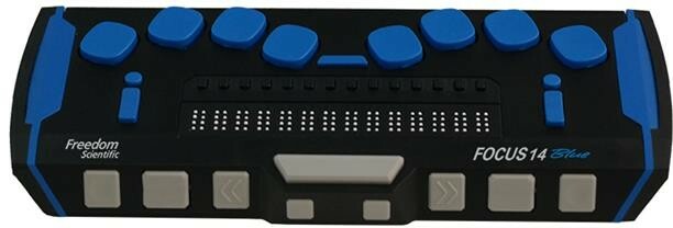
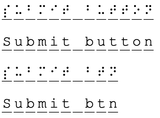
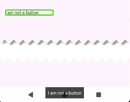
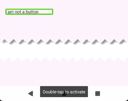


![[site community profile]](https://www.dreamwidth.org/img/comm_staff.png)


 software experience.
